Hey there, it’s been a while!
If you’ve been following along, you’d know this passion project has come a long way. We went from a scrappy MVP to a feature-rich app, and now we’re entering what I’d call the glow-up era.
This time, I wanted to do something that has been sitting on my to-do list for a very long time: redesign the entire look and feel of Money Diary.
Simple goal. Not-so-simple execution. Especially when you’re someone who openly admits that creativity is… not their strongest suit. 😅
Agenda:
- The Problem with the Old Design
- Facing My Creativity Gap
- How I Used AI to Bridge That Gap
- The Redesign Journey
- What’s Next
The Problem with the Old Design
Let’s be honest, the old UI worked. It was functional. It got the job done.
But every time I opened the app, a little voice in my head would whisper: “This could look so much better.”
The original design was built with speed in mind. I was in MVP mode — does it work? ship it. That mindset served me well for building features fast, but it left the experience feeling a bit… clinical. Flat. Not something you’d want to open every day.
For a personal finance app that’s supposed to feel like a diary — something intimate, something motivating — the UI needed to match that energy.
So I knew a redesign was coming. I just didn’t know how hard it would be.
Facing My Creativity Gap
I’ll be upfront: I am not a designer. Never have been.
I can read a good design. I can appreciate it. I can look at something and say “yep, that looks great” — but ask me to build it from scratch and I’ll stare at a blank canvas for an embarrassingly long time.
The challenge wasn’t technical. I know the tools. I know the libraries. It was the vision I was missing.
- What colors should I use?
- What vibe am I going for?
- How do I make a finance app feel warm and not intimidating?
- How do I make it look polished without drowning in design theory?
I tried the classic approach — browsing Dribbble, scrolling through Pinterest boards, bookmarking Figma community files. And while that gave me inspiration, it didn’t give me direction. I still didn’t know how to translate “I like how this looks” into something I could actually build.
That’s when I decided to try something different.
How I Used AI to Bridge That Gap
I turned to AI — specifically as a design thinking partner.
Now, I want to be clear: AI didn’t design the app for me. It can’t open Figma, it can’t make subjective taste decisions for me, and it definitely can’t tell me what I actually value in a design. But what it could do was help me structure my thinking, and that made all the difference.
Here’s roughly how I used it:
1. Articulating the vibe
I described the app — what it does, who it’s for (mostly me, honestly), what feeling I wanted people to have when they open it. Things like: “I want it to feel calm and cozy, not stressful. Like a journal, not a spreadsheet.”
AI helped me translate that into design language: warm neutrals, soft typography, generous white space, subtle accent colors instead of loud ones.
2. Generating a colour palette direction
Instead of picking colours randomly, I used AI to help me think through the psychology behind them.
This gave me a starting point I could actually evaluate rather than just guess.
3. Component layout thinking
I described specific screens and asked for layout ideas. Not code — just concepts. “I have a dashboard with income, expenses, and goals. How might I visually prioritise these without overwhelming the user?”
The answers weren’t always perfect, but they were good enough to spark something in my own thinking.
4. Sanity checking decisions
Once I had some rough ideas in place, I’d describe what I was planning to do and ask whether it made sense from a UX perspective. It was like having a rubber duck that actually talks back. 🦆
The takeaway? AI didn’t replace creativity — it helped me navigate around my lack of it. It gave me a starting point so I wasn’t paralysed by a blank canvas.
The Redesign Journey
With a rough direction in hand, I got to work.
I won’t pretend it was smooth sailing. There were moments where I rebuilt a component three times because something felt off but I couldn’t explain why. There were colour choices I thought looked great on my monitor that looked completely different on my phone. There was one weekend where I threw out a whole day’s worth of work because I decided the font wasn’t right.
But slowly, it came together.
Some of the key changes:
- New colour system — moved away from the default MUI palette and built a custom theme that felt more intentional
- Improved typography hierarchy — headings, subheadings, and body text that actually breathe
- Refined card components — more consistent spacing, softer shadows, cleaner borders
- Improved dark mode — the old dark mode was an afterthought; this time it was designed alongside the light version
- Micro-interactions — small transitions and hover states that make the app feel alive without being distracting
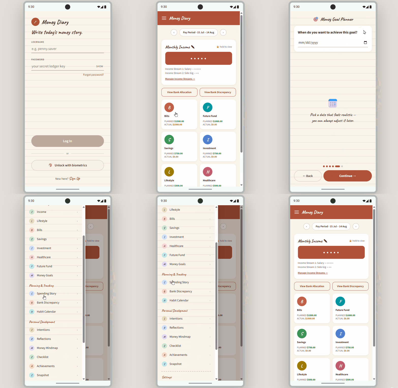
Here’s where things stand — the prototype I was aiming for, and where the implementation is today:
Prototype
Implementation
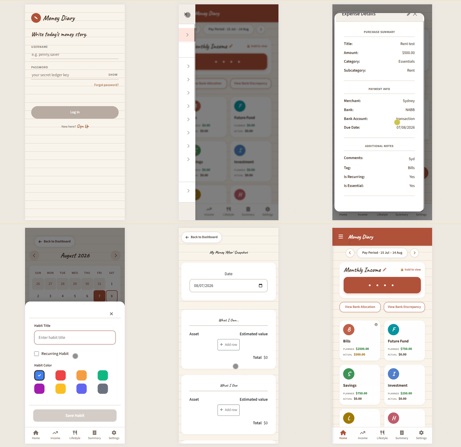
Close — but not quite there yet.
I’m not going to claim it’s a designer’s masterpiece. But it’s genuinely something I’m proud of — and more importantly, it’s something I enjoy looking at every day.
What’s Next
The redesign is still a work in progress. There are screens I haven’t touched yet and components that still feel inconsistent.
But the foundation is there, and for the first time in this project, the visual experience matches the intent behind the app.
Next on the list:
- Finishing the redesign across all remaining screens
- Finally started the architecture modernisation I teased at the end of v1.1 (yes, I’ve finally started doing it!)
- Getting a few trusted people to do some early beta testing
The dream of Google Play and the App Store is still very much alive. Just taking the scenic route to get there.
As always, if you have any comments, suggestions, or feedback — I’d love to hear from you!